
What Makes a Home Look Expensive Without a Major Renovation?
A home looks expensive when its rooms feel intentional, balanced, and well finished, not necessarily when they contain costly materials. Good proportions, restrained color, layered lighting, substantial textiles, and carefully edited decor often create more visual impact than a disruptive renovation.
The most convincing rooms also share a sense of consistency. Furniture relates to the scale of the space, finishes do not compete for attention, and everyday items have a logical place. The result feels calm and considered rather than newly purchased or overly decorated.
Start with proportion, not price
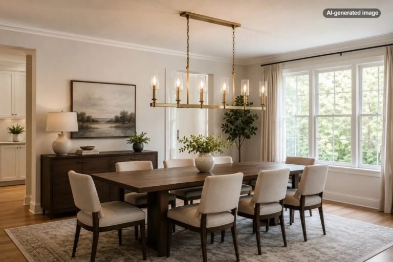
Scale is one of the clearest differences between a polished room and one that feels temporary. A small rug floating between furniture, a tiny pendant over a large table, or artwork that occupies only a narrow patch of wall can make even attractive pieces look disconnected.
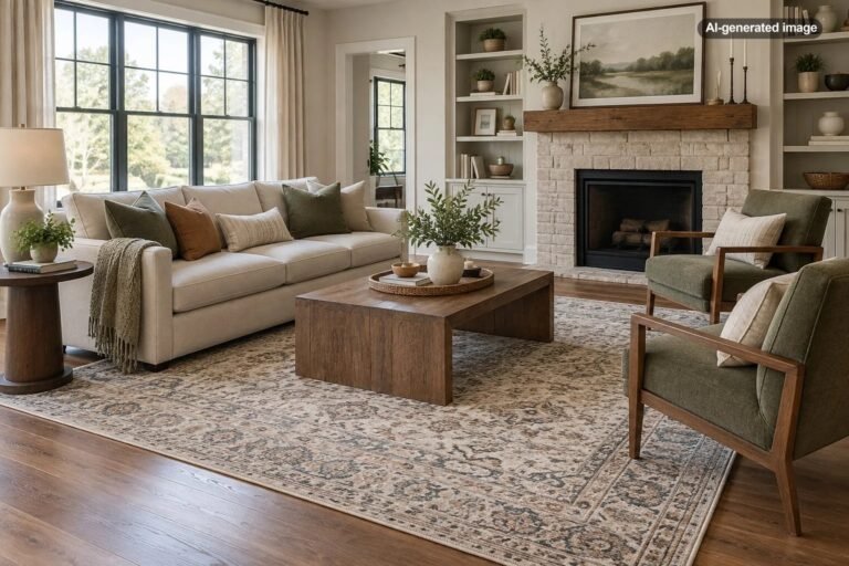
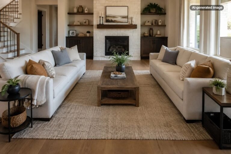
Whenever possible, choose items that visually belong to the architecture. In a living room, the front legs of the sofa and chairs should usually sit on the rug rather than surrounding it. Above a sofa or console, artwork should feel related to the furniture below it instead of appearing like a small object centered on a large blank wall.
This does not mean filling every room with oversized furniture. The goal is proportion. A compact apartment may need a shallow sofa and a slim coffee table, but those pieces should still form a complete, confident arrangement.
Use a controlled color palette
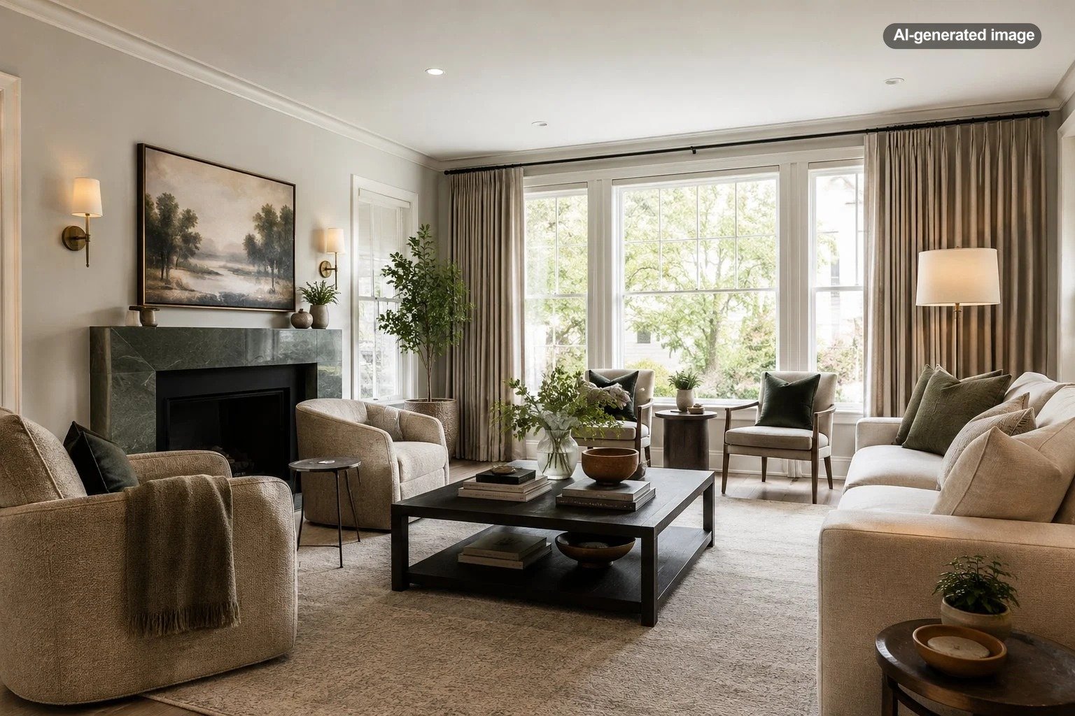
Expensive-looking interiors rarely depend on dozens of unrelated colors. They usually build depth within a limited palette: perhaps warm white, walnut, black, and muted green, or soft beige, oak, cream, and aged brass.
Choose one dominant neutral, one secondary tone, and one or two accents. Then repeat those colors across the room in different materials. A dark frame might relate to a black lamp base, while a rust-colored pillow echoes a small detail in the artwork. Repetition makes separate purchases look like part of a larger plan.
Contrast is equally important. A room composed entirely of similar pale tones can look flat unless it includes darker outlines, natural wood, textured fabric, or another grounding element. Conversely, too many high-contrast features can make a room feel busy. The most polished balance usually includes a quiet background with a few deliberate moments of emphasis.
Improve the lighting in layers
A single ceiling fixture rarely creates a flattering or finished atmosphere. Layered lighting allows a room to feel comfortable throughout the day and gives furniture, artwork, and architectural details more dimension.
- Ambient lighting provides overall illumination through ceiling fixtures or indirect light.
- Task lighting supports reading, cooking, desk work, or other focused activities.
- Accent lighting adds warmth and highlights art, shelving, plants, or textured walls.
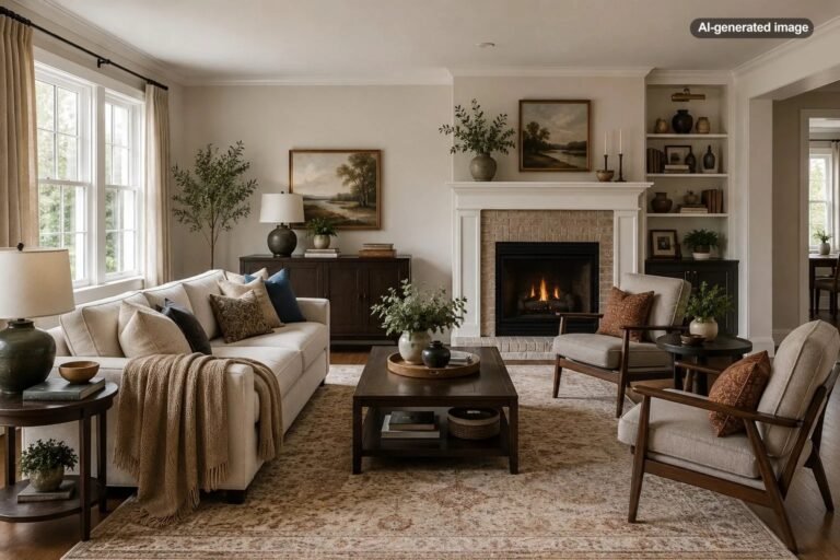
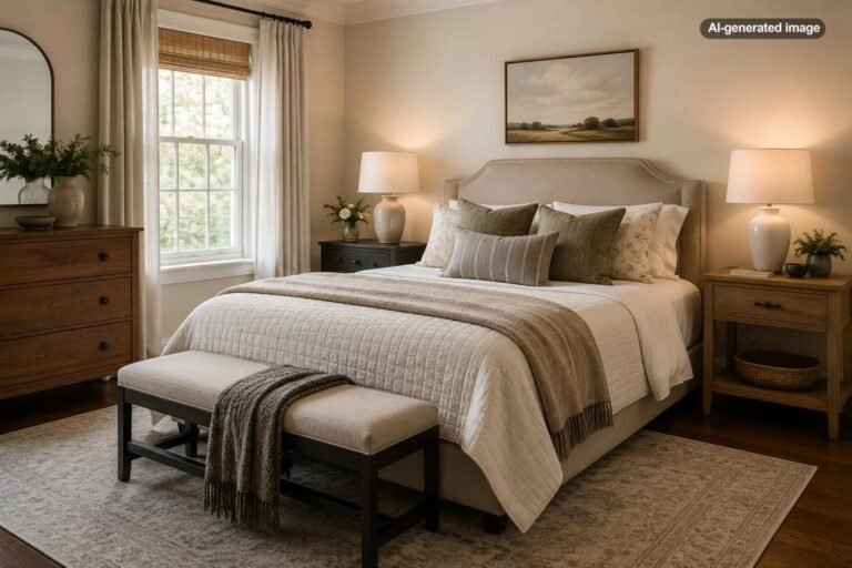
In a living room, this might mean a ceiling fixture, a floor lamp beside the sofa, and a small lamp on a console. In a bedroom, matching bedside lamps can immediately make the arrangement feel more composed.
Pay attention to the physical scale of lamps as well. A delicate lamp on a large dresser may look incidental, while a lamp with a substantial base and appropriately sized shade can anchor the entire surface.
Hang curtains higher and wider
Window treatments strongly influence how tall, soft, and complete a room feels. Curtains mounted directly on the window frame can visually shrink both the window and the wall around it. Mounting the rod closer to the ceiling and extending it beyond the frame allows the panels to sit beside the glass when open, which can make the window appear larger.
Length matters too. Panels that stop awkwardly above the floor often look accidental. Curtains should typically reach the floor cleanly, with either a slight break or a tailored straight finish depending on the style of the room.
Fabric need not be elaborate. Simple cotton, linen-look, or lined neutral panels can feel polished when they are full enough and properly placed. Thin panels stretched tightly across a wide window are more likely to look sparse than minimal.
Choose substantial textiles
Soft furnishings are among the easiest ways to add visual richness without changing the architecture. Rugs, pillows, throws, upholstered seating, bedding, and curtains help absorb sound, soften hard edges, and introduce texture.
The key is variation. A room with a flat-weave rug, smooth sofa, plain pillows, and bare windows may feel unfinished even if the colors coordinate. Mixing linen, velvet, wool, boucle, leather, woven fibers, or softly patterned fabric creates depth without requiring a louder palette.
In bedrooms, generous bedding usually looks more refined than a collection of decorative pillows. Start with sheets, a properly sized duvet or coverlet, supportive sleeping pillows, and perhaps one lumbar pillow or folded throw. The bed should look comfortable and complete rather than staged for a catalog photograph.
Rooms look expensive when the eye encounters depth, rhythm, and restraint rather than a parade of decorative objects.
Replace small, builder-basic details selectively
Minor hardware and fixtures can influence the overall impression of a room because they are touched and seen repeatedly. Cabinet pulls, switch plates, door levers, lampshades, curtain rods, and interior doormats are relatively contained details that can make a space feel more cohesive.
Consistency matters more than chasing a single fashionable finish. You do not need every metal in the house to match, but finishes should appear intentionally related. Two complementary metals used repeatedly can work well. Five unrelated finishes scattered across one room often feel accidental.
Prioritize the most visible areas first. A dated chandelier over the dining table may have more impact than replacing every knob in a secondary hallway. Likewise, updating a prominent curtain rod can improve the whole wall, while changing a barely noticed hinge will not.
Treat artwork as part of the room
Artwork looks most convincing when its scale, placement, framing, and colors relate to the surrounding furniture. One large piece, a balanced pair, or a carefully planned gallery wall will usually feel stronger than several small works distributed randomly.
Hang art low enough to connect with the furniture below it. A common mistake is placing it so high that it appears detached from the room. When arranging multiple pieces, keep spacing consistent and treat the collection as one larger composition.
Frames do not have to match exactly, but they should share a visual language. For example, a group might combine black, dark wood, and slim brass frames while maintaining similar matting and spacing. This creates variety without disorder.
Edit visible surfaces
High-end rooms are not always sparse, but they are usually edited. Coffee tables, kitchen counters, bathroom vanities, and entry consoles benefit from a clear hierarchy rather than an even distribution of small objects.
Group related pieces and vary their heights. A tray can organize remote controls, candles, or small daily items. A stack of books can support a decorative object. A bowl near the entry can hold keys without making the surface look like a drop zone.
Leave some empty space. Negative space gives important objects room to register and makes the whole arrangement easier to maintain. It also helps ordinary necessities look deliberate rather than misplaced.
What to do
- Remove everything from one visible surface.
- Return only the items that are useful, meaningful, or visually substantial.
- Group small necessities in a tray, basket, or box.
- Create one focal arrangement instead of several scattered clusters.
- Leave part of the surface empty.
Repeat materials from room to room
A home feels more expensive when adjacent spaces speak to one another. Repeating a wood tone, metal finish, paint color, frame style, or textile color creates continuity, especially in open-plan homes and small apartments where several areas are visible at once.
This does not require identical rooms. A walnut dining table might relate to a walnut picture frame in the living room and a smaller wood accent in the entry. A muted blue used on dining chairs might reappear in artwork or a bedroom throw. These quiet connections make the home feel collected as a whole.
Avoid the details that make rooms look fragmented
Some decorating choices undermine an otherwise attractive room because they create visual noise or emphasize temporary solutions. Common examples include exposed cords, crowded furniture layouts, several tiny rugs, too many decorative signs, mismatched storage containers in open view, and furniture pushed against every wall.
Another frequent issue is buying decor before resolving the room’s basic layout. Pillows and accessories cannot correct a rug that is too small, insufficient lighting, or seating that does not support conversation. Address the large visual decisions first, then add finishing details.
Where should you spend and where can you save?
Spend more thoughtfully on items that affect comfort, scale, or daily use: a supportive sofa, a durable rug in a busy room, well-fitting curtains, comfortable dining chairs, and lighting that performs properly. These pieces influence how the room functions as well as how it looks.
Save on decorative objects, side tables, frames, baskets, pillow covers, and occasional furniture when affordable versions meet the visual and practical need. Vintage, secondhand, and repurposed pieces can add individuality, particularly when their shape and material are stronger than their original finish.
Before you decide
- Does the item fit the scale of the room?
- Does it repeat a color, material, or finish already present?
- Will it improve comfort, function, or visual balance?
- Is it replacing a weak element or merely adding another object?
- Can the same effect be achieved by rearranging, editing, or refinishing what you own?
Frequently asked questions
What color makes a home look more expensive?
No single color guarantees a high-end appearance. Warm whites, soft neutrals, deep earth tones, and muted colors often work well because they are easy to layer, but proportion, lighting, texture, and consistency matter more than the specific paint shade.
Do matching furniture sets look expensive?
Matching sets can look orderly, but an entire room purchased as one collection may feel less personal. A more collected result usually combines compatible shapes, materials, and tones without making every piece identical.
Can a small home look luxurious?
Yes. Small rooms often benefit most from careful scale, concealed storage, fewer substantial objects, coordinated finishes, and strong lighting. Limiting clutter and maintaining clear pathways can make a compact space feel especially polished.
What is the fastest way to improve a living room?
Correct the rug size, adjust the furniture layout, improve the lighting, and simplify visible surfaces. These changes address the room as a whole and usually create more impact than adding new decorative accessories.
Does everything need to be neutral?
No. Color can look sophisticated when it is repeated deliberately and balanced by quieter elements. The goal is a controlled palette, not the absence of personality.