
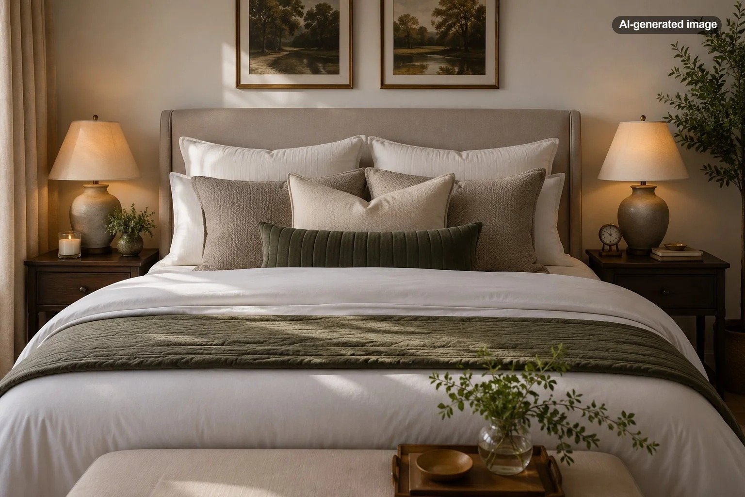
How to Create a Luxury-Looking Bed With Ordinary Bedding
A bed does not need designer linens, an oversized headboard, or a mountain of decorative pillows to look luxurious. What creates the effect is control: balanced proportions, intentional layers, smooth surfaces, and a color palette that feels edited rather than accidental.
Ordinary sheets, a basic comforter, and inexpensive pillow covers can look remarkably polished when they are sized correctly and arranged with care. The goal is not to add more of everything. It is to make each visible element look deliberate.
Start With Proportion, Not Price
The quickest way to make a bed look less polished is to use bedding that appears too small. A comforter that barely reaches the edges of the mattress can make even attractive fabric look skimpy. A simple, affordable coverlet with a fuller drop often looks more substantial than a costly duvet that sits awkwardly on top.
Whenever possible, choose a top layer that extends comfortably over both sides of the mattress and covers the visible foundation. On a thick mattress, sizing up can provide a more generous drape, although the exact result depends on the dimensions of the bedding and whether the bed has a footboard.
Pay attention to the pillows as well. Standard pillows can look undersized across a king bed, while oversized decorative pillows can overwhelm a compact full-size bed. Luxury is largely a matter of scale looking correct.
Choose a Restrained Color Palette
High-end beds often rely on fewer colors than expected. A quiet palette allows texture, shape, and shadow to do more of the visual work. White, ivory, oatmeal, stone, taupe, charcoal, muted blue, olive, and soft brown are especially easy to combine without creating visual noise.
This does not mean the bed must be neutral. A deep rust quilt, navy duvet, or forest-green coverlet can look refined when the surrounding layers stay disciplined. The useful rule is to choose one dominant color, one supporting neutral, and one smaller accent.
Repeated colors also help ordinary pieces look coordinated. A pale beige pillowcase can relate to a stripe in the throw. A charcoal border on a sham can echo a nearby lamp or picture frame. These small repetitions create the impression of a planned room rather than a collection assembled over time.
Build the Bed in Clear Layers
A luxurious bed has visible depth, but the layers should remain easy to understand. Start with the sleeping pillows, add one row of larger pillows or shams, then introduce a single decorative shape in front. Finish with a folded quilt, blanket, or throw near the foot of the bed.
What to do
- Place the sleeping pillows upright or at a slight angle against the headboard.
- Add two or three larger pillows in front, depending on the width of the bed.
- Use one lumbar pillow or one pair of smaller square pillows as the accent.
- Fold the duvet or comforter back to expose the sheets and create another horizontal layer.
- Add a coverlet or throw across the lower third of the bed.
Not every bed needs every layer. A small bedroom may look better with two sleeping pillows, two shams, and one lumbar pillow. A larger bed with a tall headboard can support more height and volume. The arrangement should suit the scale of the room, not imitate a showroom display without adjustment.
Make the Largest Surfaces Look Smooth
Wrinkles are normal, particularly with cotton and linen, but uncontrolled creasing can make a bed look unfinished. Focus your effort on the broadest visible areas: the top of the duvet, the folded edge near the pillows, and the front faces of the shams.
You do not need to press every piece. Shake out the bedding before placing it on the bed, pull the corners into alignment, and smooth the surface with your hands. If the care label permits, light steaming can help with stubborn folds. Always follow the fabric’s care instructions and avoid applying high heat blindly to synthetic blends or delicate finishes.
For a fuller duvet, distribute the insert evenly into the corners and along the edges. Empty corners and clumps in the center are far more noticeable than the price or thread count of the cover.
The most luxurious-looking bed is usually the one that has been edited, aligned, and finished rather than simply filled with more things.
Use Texture Instead of Excess Decoration
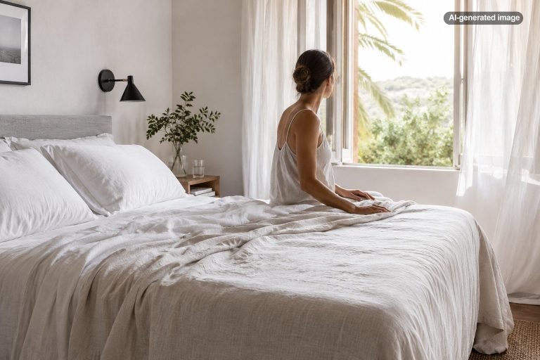
Texture gives a simple bed dimension without requiring bold patterns or expensive materials. Combine surfaces that catch light differently: crisp cotton sheets, a matte quilt, a softly woven blanket, a nubby lumbar pillow, or a smooth velvet accent.
The key is contrast. If every layer is fluffy, the bed can lose shape. If every layer is flat and smooth, it may feel severe. Pair one crisp element with one softer element and one visibly woven element. Even inexpensive bedding looks more considered when the textures are distinct.
Pattern can play the same role, but it is usually strongest in a limited dose. A subtle stripe, windowpane check, narrow border, or small botanical print can add personality without competing with the rest of the room.
Arrange Pillows With Restraint
Decorative pillows should make the bed feel complete, not create a nightly obstacle course. One long lumbar pillow often looks more tailored than several small cushions. On a queen bed, two larger shams with one lumbar pillow can provide enough structure. On a king bed, three large square pillows or two king shams may fill the width more convincingly.
A useful arrangement has a clear hierarchy: tallest at the back, medium in the middle, smallest in front. Avoid scattering pillows of similar size at unrelated angles. Symmetry is the simplest route to a polished look, while slight asymmetry can work in relaxed rooms when the shapes and colors remain balanced.
Finish the Foot of the Bed Intentionally
The lower third of the bed is an ideal place for contrast. A folded quilt adds structure, while a loosely draped throw creates a more relaxed effect. Choose one approach rather than combining several blankets in a way that looks accidental.
For a tailored room, fold the blanket into a clean band and align it with the sides of the mattress. For a softer look, drape it diagonally across one corner, but keep enough of the bed visible so the throw reads as an accent rather than unfinished laundry.
The accent layer can also solve practical problems. It can protect the duvet from pets, provide extra warmth, or introduce a washable surface that is easier to maintain than the main bedding.
Pay Attention to the Bed Frame and Surroundings
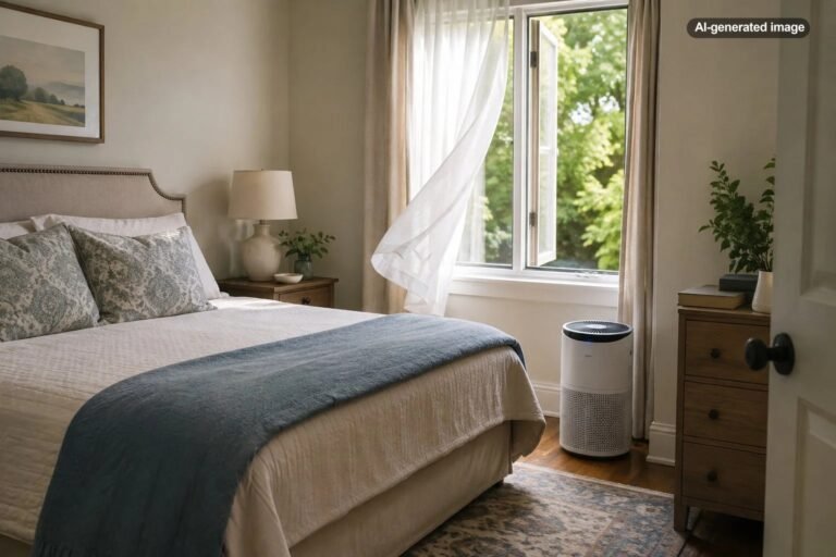
Bedding cannot look fully polished if the surrounding area feels visually neglected. Hide exposed metal rails when practical, straighten the bed skirt if one is used, and keep cords, storage bins, and loose items from crowding the visible edges of the bed.
Nightstands do not need to match perfectly, but their visual weight should feel balanced. Similar lamp heights, repeated finishes, or coordinated artwork can frame the bed and make modest bedding feel more intentional.
A clean headboard also matters. If there is no headboard, a large piece of art, a pair of framed prints, or a painted wall treatment can give the bed a visual anchor. The arrangement should be securely installed and appropriately scaled for the wall.
Avoid the Details That Make a Bed Look Busy
Common styling mistakes include using too many unrelated colors, stacking pillows higher than the headboard, mixing several bold patterns, and layering blankets until the mattress disappears. Another frequent problem is allowing each side of the bed to fall differently, which makes the arrangement look rushed.
Matching sets can be useful, but using every included piece at once may feel overly coordinated. Consider separating the set and combining it with solid sheets, a contrasting throw, or simpler pillowcases. A little variation creates depth; too much matching can flatten the room.
Before you decide
- Does the top layer cover the mattress generously?
- Are the main colors repeated elsewhere in the room?
- Do the pillows form a clear, balanced arrangement?
- Is there enough texture without too many patterns?
- Does the foot-of-bed layer look placed rather than dropped?
- Can the bed be reset without an unreasonable amount of effort?
Keep the Routine Realistic
A beautiful bed should still function for everyday life. If a complicated arrangement is unlikely to be rebuilt each morning, simplify it. Two good shams and one lumbar pillow can look more refined than seven cushions that spend most of their time on the floor.
Create a repeatable sequence: pull up the sheets, smooth the top layer, fold it back evenly, position the sleeping pillows, add the decorative pillows, and straighten the blanket at the foot. Once the arrangement is established, the daily reset can remain straightforward.
The final effect comes from consistency rather than expense. Generous proportions, controlled color, visible texture, and careful alignment can make ordinary bedding look calm, substantial, and thoughtfully designed.
Frequently Asked Questions
Does white bedding always look more luxurious?
No. White creates a crisp hotel-like effect, but deep colors and warm neutrals can look equally refined. Consistency, scale, and texture matter more than choosing white alone.
How many decorative pillows should a bed have?
For many beds, one to three decorative pillows are enough. A single lumbar pillow is practical and tailored, while two or three larger pillows may suit a wider bed or taller headboard.
Should a duvet be larger than the mattress size?
A larger duvet can create a fuller drop on thick mattresses, but dimensions vary. Measure the mattress height and compare it with the listed bedding dimensions before sizing up, especially when a footboard or low bed frame affects the drape.
Can mismatched bedding still look coordinated?
Yes. Repeat one or two colors, keep the patterns limited, and vary textures intentionally. Mismatched pieces often look sophisticated when they share a clear palette and similar visual weight.