

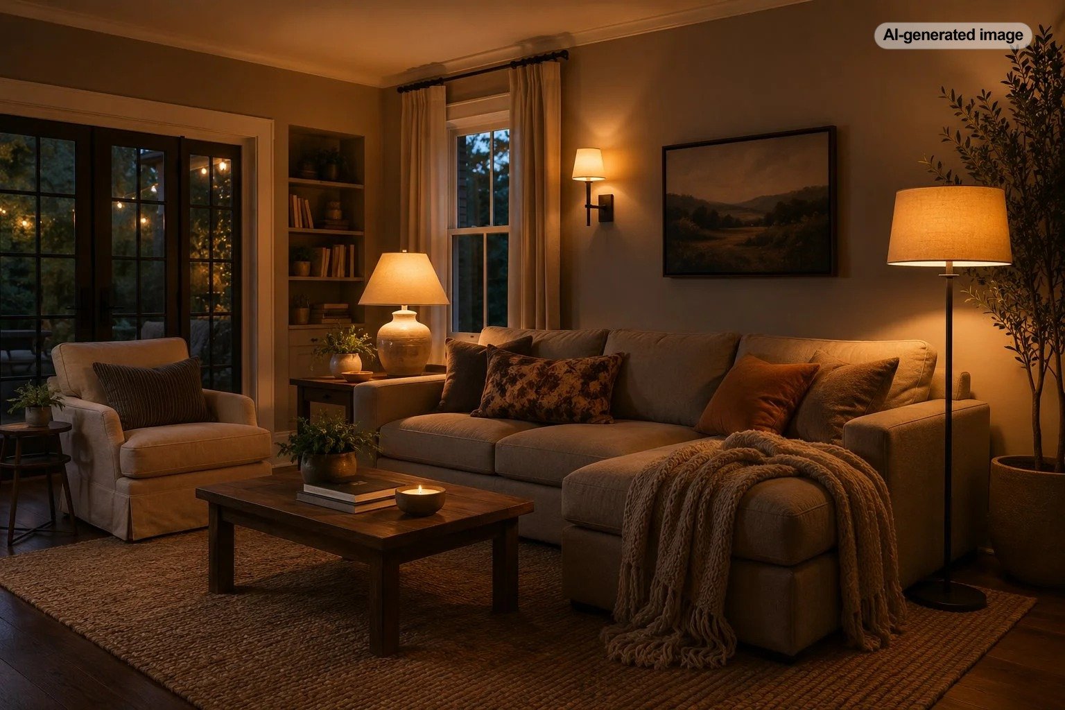
What Color Light Bulb Makes a Living Room Feel Warmest?
For most living rooms, a 2700K warm-white or soft-white bulb creates the warmest appearance without making the room look excessively yellow. It is close to the familiar glow associated with traditional incandescent lighting and generally flatters wood, warm paint colors, upholstery, and skin tones.
For an even cozier, more candlelit mood, consider bulbs in the 2200K to 2400K range, especially in table lamps, sconces, and decorative fixtures. These extra-warm bulbs are atmospheric rather than crisp, so they work best as part of a layered lighting plan instead of as the room’s only light source.
Why 2700K usually feels warmest without looking dim
Light bulb color is described by its correlated color temperature, measured in kelvins and shown with the letter K. The scale can feel backward at first: lower Kelvin numbers look warmer and more golden, while higher numbers appear cooler and bluer.
A 2700K bulb sits in a useful middle ground. It provides a distinctly warm cast, but it usually keeps cream walls, natural fabrics, artwork, and faces recognizable. That makes it practical for a room used for conversation, television, reading, entertaining, and everyday family life.
Extra-warm bulbs below 2700K can feel softer and more intimate, but they may also mute blues, greens, and cool grays. Whether that is appealing depends on the room. A traditional living room with walnut furniture and rust-colored textiles may glow beautifully under 2200K light. A pale blue and charcoal room may look muddy under the same bulb.
| Color temperature | Typical appearance | Best living room use |
|---|---|---|
| 2200K-2400K | Deep amber, candlelike | Accent lamps, evening mood, decorative sconces |
| 2700K | Warm, soft, familiar | Most living rooms and general ambient lighting |
| 3000K | Warm but cleaner and less golden | Modern rooms, reading areas, mixed-use spaces |
| 3500K | Neutral, relatively crisp | Task-oriented spaces or rooms connected to a cooler kitchen |
| 4000K-5000K | Cool white to daylight-like | Usually better for utility or detailed task lighting than cozy lounging |
Warm white, soft white, and daylight labels can be confusing
Names such as soft white, warm white, bright white, and daylight are helpful hints, but they are not always used identically across manufacturers. The Kelvin number on the package is the more dependable guide.
Soft white commonly refers to a bulb around 2700K. Warm white may describe 2700K or 3000K, depending on the product. Daylight bulbs are commonly much cooler and may be labeled around 5000K or higher. When two boxes use similar marketing language, compare their Kelvin ratings before deciding.
Brightness changes how warm light feels
Kelvin measures color appearance, while lumens measure brightness. A high-lumen 2700K bulb can still feel intense in a small living room, particularly in an uncovered ceiling fixture. A lower-lumen bulb placed behind a shade may feel softer even though both bulbs have the same color temperature.
Instead of trying to illuminate the entire room with one very bright source, spread the light among several fixtures. A ceiling light can provide general visibility, while table lamps and floor lamps add pools of warmer light at seated eye level. This layering reduces harsh contrast and makes the room feel more comfortable after dark.
Dimmers are especially useful because they allow the room to shift from practical to relaxed. Confirm that the bulb is labeled dimmable and that it is compatible with the dimmer being used. Some LED combinations may flicker, buzz, fail to dim smoothly, or shut off before reaching a low setting.
Match the bulb color to the room’s finishes
Warm lighting tends to strengthen red, orange, yellow, tan, and brown undertones. It often works naturally with oak, walnut, brass, leather, terracotta, beige, ivory, and warm white paint. It can also make a room with many hard surfaces feel visually softer.
Rooms dominated by crisp white, polished chrome, blue-gray paint, or cool marble may benefit from 3000K rather than 2700K. The light will still feel welcoming, but it is less likely to pull white surfaces toward cream or make cool colors appear dull.
Pay attention to color rendering, not only Kelvin
Two bulbs with the same Kelvin rating can make a room look different. Color rendering describes how naturally a light source reveals the colors of objects compared with a reference light source. Bulbs with stronger color rendering generally make artwork, fabrics, wood, food, and skin tones look more convincing.
For a living room where color matters, look for an LED bulb with a color rendering index, or CRI, of at least 80. A rating of 90 or higher is often preferable for artwork, richly colored textiles, makeup areas, or rooms where subtle material differences are important.
Color rendering is not the same as warmth. A low-quality 2700K bulb may create a yellow cast while flattening reds or making skin look dull. A well-rendering 2700K bulb can feel warm while preserving more of the room’s intended color palette.
Consider dim-to-warm or tunable-white bulbs
A dim-to-warm LED changes both brightness and color as it is dimmed. At full output, it may produce light around 2700K or 3000K, then become progressively warmer as the level drops. This resembles the behavior people often associate with dimmed incandescent or halogen lighting.
Tunable-white bulbs offer a broader adjustable range. They can provide cleaner light for reading or cleaning and warmer light for television, conversation, or late-evening relaxation. They are useful in living rooms that serve several purposes, though they add controls and setup that a simple fixed-color bulb does not require.
The coziest living rooms rarely depend on one perfect bulb; they combine warm color, moderate brightness, and light placed where people actually sit.
Common lighting mistakes that make a living room feel colder
- Choosing daylight bulbs for every fixture: Cooler bulbs can be useful for precise tasks, but they often make an evening living room feel more like a work area.
- Mixing several unrelated color temperatures: A 2700K lamp beside a 5000K ceiling light can make the room look visually unsettled.
- Using only recessed ceiling lights: Downlight alone can create shadows around faces and leave the room feeling flat.
- Ignoring lampshades: An opaque or warm-toned shade can soften a bulb, while clear glass or an exposed filament can increase glare.
- Buying by watts instead of lumens: Watts describe energy use, not the amount of visible light produced.
Before you decide
- Start with 2700K if you want a reliably warm, versatile result.
- Use 2200K to 2400K in accent fixtures for a deeper evening glow.
- Consider 3000K when the room has cool finishes or connects to a brighter adjoining space.
- Compare lumens so the bulb is not brighter than the fixture or room requires.
- Look for good color rendering when artwork, upholstery, or skin tones matter.
- Check dimmer and fixture compatibility before installing dimmable LEDs.
Frequently asked questions
Is 2700K or 3000K better for a living room?
Choose 2700K for a softer, more traditional glow. Choose 3000K for a slightly cleaner appearance, particularly in modern rooms, cool-toned interiors, or open plans where nearby spaces already use 3000K lighting.
Is 2200K too yellow for a living room?
It can be too amber for general lighting, reading, or color-sensitive tasks. It is often effective in one or two lamps used for evening atmosphere.
Can different living room lamps use different Kelvin temperatures?
They can, but small differences are easier to live with than dramatic ones. A combination of 2400K and 2700K may feel intentional, while 2700K and 5000K in the same sightline can look mismatched.
Does a warm bulb make a room physically warmer?
No. The term warm describes the visual color of the light, not the room’s temperature. LED bulbs also produce far less waste heat than traditional incandescent bulbs.