
How to Choose Art That Is the Right Size for Your Wall
Choosing the right size art is less about matching a picture to an empty rectangle and more about creating a convincing relationship between the artwork, the wall, and the furniture nearby. Art that is too small can look stranded, while art that is too large may crowd moldings, lamps, or architectural details.
A useful starting point is to treat the artwork as part of the furniture grouping rather than as a separate decoration. Measure the area it needs to visually anchor, choose a width that feels substantial within that area, and test the outline before putting hardware into the wall.
Start With the Area the Art Needs to Anchor
Do not begin by measuring the entire wall unless the wall is completely open. In most rooms, art belongs to a smaller visual zone defined by a sofa, bed, console, dining table, desk, fireplace, or pair of lamps.
For example, a sofa may sit on a 14-foot wall, but the relevant measurement is usually the sofa itself. A console between two doorways should be sized according to the console and the space between those openings, not according to the total room width.
On a genuinely blank wall, identify the usable area by accounting for corners, door swings, switches, vents, sconces, and nearby furniture. The artwork does not need to fill every inch, but it should appear connected to the room rather than floating in leftover space.
What to measure
- Measure the width and height of the usable wall area.
- Measure the furniture the art will hang above, when applicable.
- Note nearby lamps, windows, moldings, switches, and doors.
- Mark the approximate eye-level center of the arrangement.
- Record the outside dimensions of the art, including its frame and mat.
Use Furniture Width as Your Most Reliable Guide
When artwork hangs above furniture, its total width should generally be narrower than the furniture but wide enough to feel visually attached to it. A range of about two-thirds to three-quarters of the furniture width is a practical starting point rather than an inflexible law.
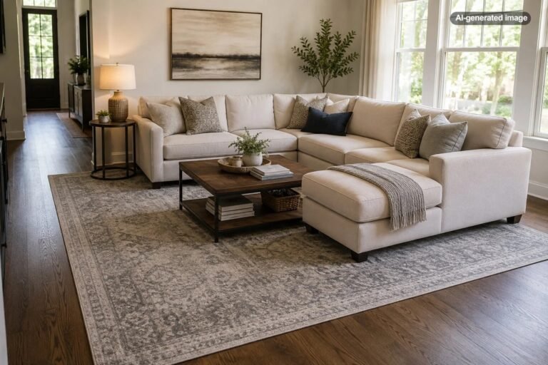
Above an 84-inch sofa, for example, an artwork or grouped arrangement approximately 56 to 63 inches wide will usually feel more balanced than a single 24-inch frame. Above a 60-inch console, a piece around 40 to 45 inches wide may provide a convincing sense of proportion.
The measurement applies to the complete visual arrangement. Two framed prints that are each 20 inches wide with a 3-inch gap occupy 43 inches together. A gallery wall should likewise be measured from its farthest left edge to its farthest right edge.
The wall provides the background, but the nearby furniture usually determines the scale.
When a smaller piece can still work
Small art does not have to look timid. It can work beautifully when placed in a naturally narrow zone, such as between windows, above a nightstand, beside a bookcase, or within a built-in niche. It may also succeed when intentionally surrounded by generous negative space in a restrained room.
If a favorite piece is too small for the intended location, consider giving it more visual presence with a wider mat, a more substantial frame, a pair of coordinating pieces, or a compact salon-style grouping. Avoid choosing an oversized frame solely to disguise a tiny image; the proportions within the frame should still look deliberate.
Choose the Right Format for the Wall Shape
The artwork’s orientation should respond to the shape of the space. A wide horizontal piece often suits a sofa, sideboard, headboard, or long dining wall. A vertical piece can emphasize height in a narrow entry, stair landing, column-like wall section, or space between tall windows.
Square art is flexible but can look undersized above a long piece of furniture unless it is generously scaled or used as part of a pair. Diptychs and triptychs are useful when one large piece would be difficult to transport, frame, or afford, provided the panels read as a unified composition.
| Wall or furniture shape | Art format to consider | What to avoid |
|---|---|---|
| Long sofa or sideboard | Large horizontal piece, pair, or wide grouping | One small vertical frame centered alone |
| Narrow wall section | Vertical piece or compact stacked pair | Art that nearly touches both side edges |
| Tall open wall | Large vertical work or a taller gallery arrangement | Hanging a small piece near the ceiling |
| Square wall zone | Square art, grid, or balanced organic grouping | An arrangement that is wide but visually shallow |
Account for the Frame, Mat, and Visual Weight
Published artwork dimensions may refer to the image, canvas, or paper rather than the final framed size. A 24-by-36-inch print can become substantially larger after adding a mat and frame, so always plan with the outside dimensions that will actually occupy the wall.
Visual weight matters as much as physical size. A dark painting in a thick black frame may feel larger than a pale line drawing in a slim natural-wood frame, even when their dimensions match. Bold color, strong contrast, dense imagery, and heavy frames all increase presence.
This means two similarly sized pieces may not balance each other in a symmetrical arrangement. When pairing art, compare not only the frame dimensions but also the amount of blank space, color intensity, and darkness within each work.
Hang the Art at the Right Height
Correctly sized art can still look wrong when it is hung too high. On an open wall, placing the center of the artwork or arrangement around 57 to 60 inches from the floor is a useful starting point. The goal is comfortable viewing, not obedience to a single universal number.
When hanging art above furniture, relate it to the furniture first. In many rooms, leaving roughly 6 to 10 inches between the top of the furniture and the bottom of the frame creates a connected composition. Very tall furniture, deep mantels, high headboards, or accessories on a console may require adjustment.
Rooms where people are usually seated, such as dining rooms, may suit a slightly lower placement. Homes with very tall occupants do not necessarily need art near the ceiling; artwork should relate to the room as a whole, not only to one person’s standing eye level.
Treat a Gallery Wall as One Large Artwork
A gallery wall should be sized and positioned as a single composition. First decide the outer width and height, then arrange the individual frames within that boundary. Consistent spacing, often around 2 to 3 inches, helps separate an intentional collection from a scattering of unrelated frames.
For a grid, matching frame sizes and equal gaps create order. For an organic arrangement, begin with the largest or most visually important piece and build outward while maintaining a reasonably consistent distance between neighboring frames.
The outside silhouette matters. A gallery wall above a sofa should usually be wider than it is tall, while a grouping on a stairway or narrow landing may follow a rising or vertical shape. Do not keep adding small frames merely to fill holes; edit the arrangement until its overall outline feels coherent.
Test the Size Before You Buy or Hang
Artwork often appears larger online or while held at arm’s length than it will on a furnished wall. A full-scale template is the simplest way to prevent a disappointing size choice.
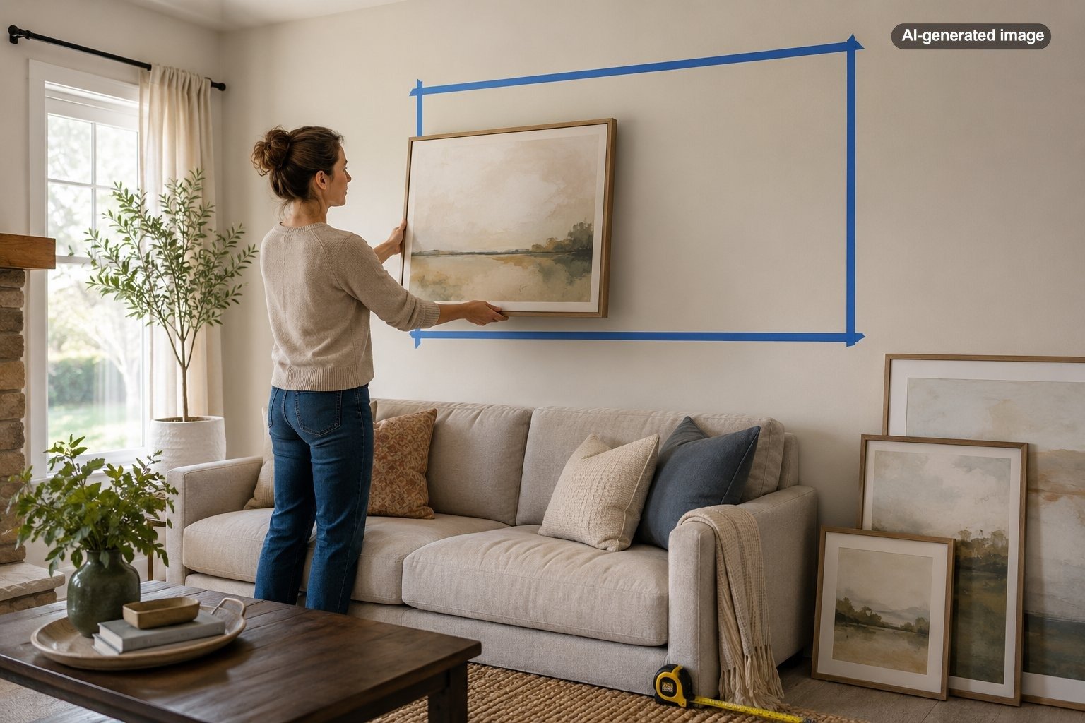
Cut kraft paper, newspaper, or removable painter’s paper to the proposed outside dimensions and tape it to the wall with a finish-safe product. For a gallery wall, make a template for every frame. Step back to the doorway, sit in the usual seating positions, and view the arrangement from adjoining rooms.
A phone photo can also reveal proportion problems that are difficult to notice while standing close to the wall. If the template looks slightly too small, the actual artwork will rarely gain enough presence from color alone. Moving up one size is often more successful than trying to compensate by hanging the piece higher.
Before you decide
- Confirm that the listed dimensions include the frame.
- Compare the total width with the furniture below it.
- Check that doors and cabinet fronts can open freely.
- Leave breathing room around moldings, sconces, and windows.
- View a full-scale template from multiple positions.
- Confirm that the wall and hanging hardware can support the finished piece.
Common Art-Sizing Mistakes
The most common mistake is choosing a piece based on the image alone and ignoring its relationship to the room. A beautiful print can still look apologetic above a broad sofa when its frame occupies only a small fraction of the furniture width.
Another mistake is using height to compensate for insufficient width. Hanging a small frame higher does not make it feel larger; it usually makes it appear disconnected. Likewise, spreading a few small frames far apart does not create a large gallery wall. The eye reads the gaps before it reads the collection.
Art can also be too large. A frame that nearly touches the sofa ends, window trim, ceiling, or adjacent walls may feel squeezed into place. When the available wall is unusually narrow, choosing a vertical work, a stacked pair, or a smaller composition with intentional negative space is often better than forcing in a wide piece.
Frequently Asked Questions
Should artwork be centered on the wall or the furniture?
Usually, center it on the furniture or functional grouping below it. Centering art on the entire wall can look off-balance when the sofa, bed, or console is not centered in that same space.
Can art be wider than the furniture below it?
It can, but the result is harder to balance. Art that extends beyond the furniture may visually overpower it or seem unsupported. A wider arrangement works best when other elements, such as lamps or side tables, broaden the complete composition.
Is one large piece better than several small pieces?
Neither is inherently better. One large piece creates a calm focal point and is easier to arrange. Multiple pieces offer flexibility and personality but require more attention to spacing, visual weight, and the overall outline.
What should I do when I love a piece that is too small?
Move it to a narrower wall, add a generous mat and appropriately scaled frame, pair it with related work, or incorporate it into a tightly spaced gallery arrangement. Do not leave it isolated in the center of an expansive wall unless the negative space is a deliberate part of the design.
How much empty wall should remain around the art?
There is no universal amount. The piece should have enough space to breathe without appearing detached from the room. Architectural edges, furniture width, ceiling height, and the artwork’s visual intensity all affect how much negative space feels balanced.
The right art size is ultimately the one that makes the wall, furnishings, and artwork read as a single composition. Begin with measurable proportions, test the real outline, and then adjust for the character of the room. A few minutes with a tape measure and paper template can prevent years of wondering why an otherwise lovely piece never quite looked at home. 🙂